Examples
This example use randoms values for wind speed and direction(ws and wdnotebooks/windrose_sample_poitiers_csv.ipynb variables). In situation, these variables are loaded with reals values (1-D array), from a database or directly from a text file. See this notebook for an example of real data.
[1]:
import numpy as np

N = 500
ws = np.random.random(N) * 6
wd = np.random.random(N) * 360
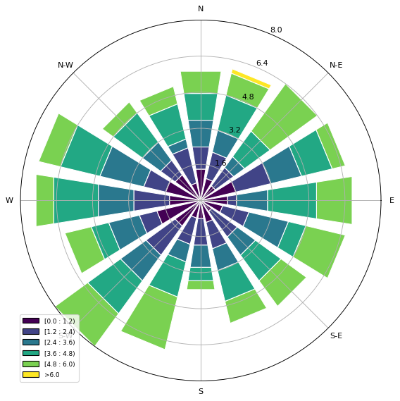
A stacked histogram with normed (displayed in percent) results.
[2]:
from windrose import WindroseAxes

ax = WindroseAxes.from_ax()
ax.bar(wd, ws, normed=True, opening=0.8, edgecolor="white")
ax.set_legend()
[2]:
<matplotlib.legend.Legend at 0x7f21753257f0>
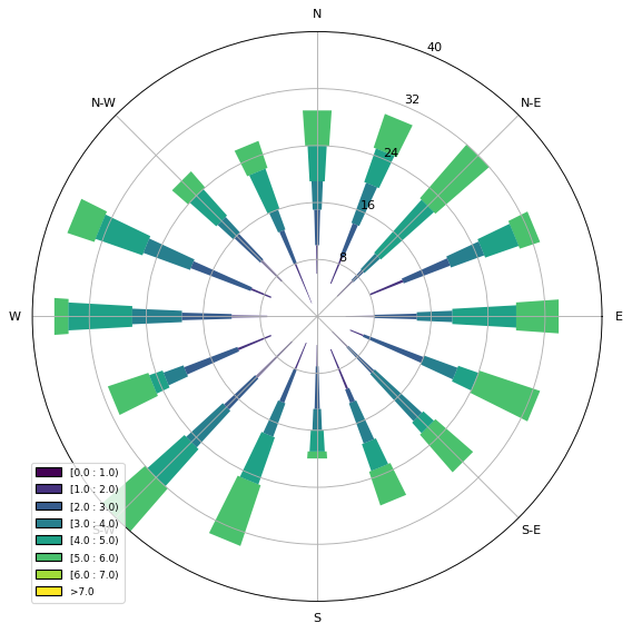
Another stacked histogram representation, not normed, with bins limits.
[3]:
ax = WindroseAxes.from_ax()
ax.box(wd, ws, bins=np.arange(0, 8, 1))
ax.set_legend()
[3]:
<matplotlib.legend.Legend at 0x7f2174ff8410>
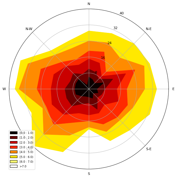
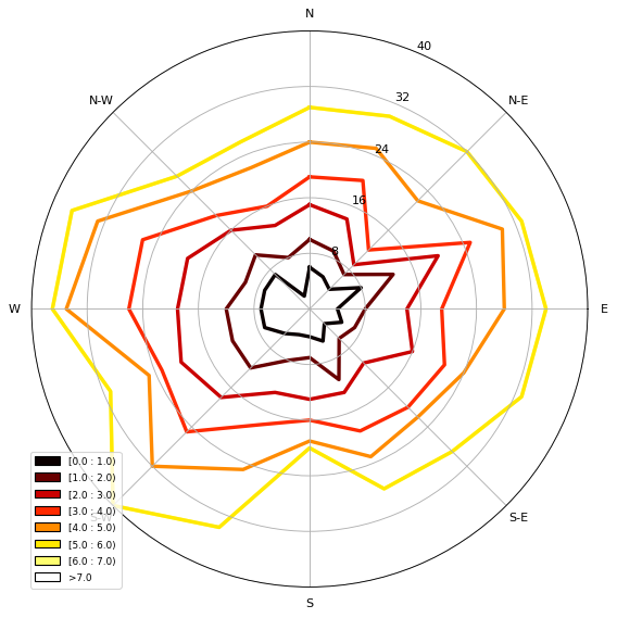
A windrose in filled representation, with a controlled colormap.
[4]:
from matplotlib import cm

ax = WindroseAxes.from_ax()
ax.contourf(wd, ws, bins=np.arange(0, 8, 1), cmap=cm.hot)
ax.set_legend()
[4]:
<matplotlib.legend.Legend at 0x7f2175259a90>
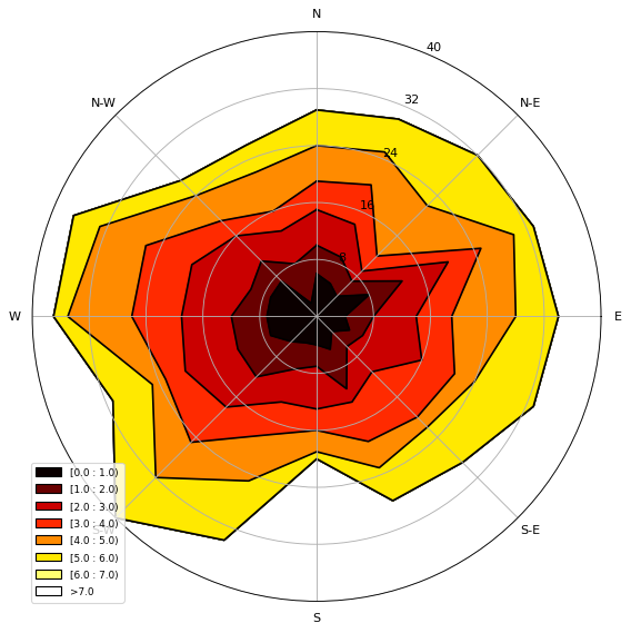
Same as above, but with contours over each filled region…
[5]:
ax = WindroseAxes.from_ax()
ax.contourf(wd, ws, bins=np.arange(0, 8, 1), cmap=cm.hot)
ax.contour(wd, ws, bins=np.arange(0, 8, 1), colors="black")
ax.set_legend()
[5]:
<matplotlib.legend.Legend at 0x7f21752df9d0>
…or without filled regions.
[6]:
ax = WindroseAxes.from_ax()
ax.contour(wd, ws, bins=np.arange(0, 8, 1), cmap=cm.hot, lw=3)
ax.set_legend()
[6]:
<matplotlib.legend.Legend at 0x7f2174e8f9d0>
After that, you can have a look at the computed values used to plot the windrose with the ax._info dictionary :
ax._info['bins']: list of bins (limits) used for wind speeds. If not set in the call, bins will be set to 6 parts between wind speed min and max.ax._info['dir']: list of directions “boundaries” used to compute the distribution by wind direction sector. This can be set by the nsector parameter (see below).ax._info['table']: the resulting table of the computation. It’s a 2D histogram, where each line represents a wind speed class, and each column represents a wind direction class.
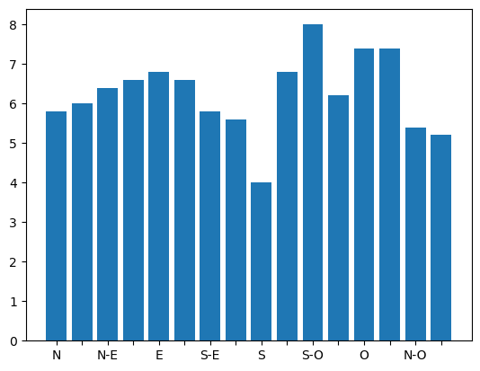
So, to know the frequency of each wind direction, for all wind speeds, do:
[7]:
ax.bar(wd, ws, normed=True, nsector=16)
table = ax._info["table"]
wd_freq = np.sum(table, axis=0)
and to have a graphical representation of this result:
[8]:
import matplotlib.pyplot as plt

direction = ax._info["dir"]
wd_freq = np.sum(table, axis=0)

plt.bar(np.arange(16), wd_freq, align="center")
xlabels = (
    "N",
    "",
    "N-E",
    "",
    "E",
    "",
    "S-E",
    "",
    "S",
    "",
    "S-O",
    "",
    "O",
    "",
    "N-O",
    "",
)
xticks = np.arange(16)
plt.gca().set_xticks(xticks)
plt.gca().set_xticklabels(xlabels)
[8]:
[Text(0, 0, 'N'),
 Text(1, 0, ''),
 Text(2, 0, 'N-E'),
 Text(3, 0, ''),
 Text(4, 0, 'E'),
 Text(5, 0, ''),
 Text(6, 0, 'S-E'),
 Text(7, 0, ''),
 Text(8, 0, 'S'),
 Text(9, 0, ''),
 Text(10, 0, 'S-O'),
 Text(11, 0, ''),
 Text(12, 0, 'O'),
 Text(13, 0, ''),
 Text(14, 0, 'N-O'),
 Text(15, 0, '')]
In addition of all the standard pyplot parameters, you can pass special parameters to control the windrose production. For the stacked histogram windrose, calling help(ax.bar) will give : bar(self, direction, var, **kwargs) method of windrose.WindroseAxes instance Plot a windrose in bar mode. For each var bins and for each sector, a colored bar will be draw on the axes.
Mandatory:
direction: 1D array - directions the wind blows from, North centredvar: 1D array - values of the variable to compute. Typically the wind speeds
Optional:
nsector: integer - number of sectors used to compute the windrose table. If not set, nsectors=16, then each sector will be 360/16=22.5°, and the resulting computed table will be aligned with the cardinals points.bins: 1D array or integer - number of bins, or a sequence of bins variable. If not set, bins=6 between min(var) and max(var).blowto: bool. If True, the windrose will be pi rotated, to show where the wind blow to (useful for pollutant rose).colors: string or tuple - one string color ('k'or'black'), in this case all bins will be plotted in this color; a tuple of matplotlib color args (string, float, rgb, etc), different levels will be plotted in different colors in the order specified.cmap: a cm Colormap instance frommatplotlib.cm. - ifcmap == Noneandcolors == None, a default Colormap is used.edgecolor: string - The string color each edge bar will be plotted. Default : no edgecoloropening: float - between 0.0 and 1.0, to control the space between each sector (1.0 for no space)mean_values: Bool - specify wind speed statistics with direction=specific mean wind speeds. If this flag is specified, var is expected to be an array of mean wind speeds corresponding to each entry indirection. These are used to generate a distribution of wind speeds assuming the distribution is Weibull with shape factor = 2.weibull_factors: Bool - specify wind speed statistics with direction=specific weibull scale and shape factors. If this flag is specified, var is expected to be of the form [[7,2], …., [7.5,1.9]] where var[i][0] is the weibull scale factor and var[i][1] is the shape factor
Probability density function (pdf) and fitting Weibull distribution
[9]:
from windrose import WindAxes

ax = WindAxes.from_ax()
bins = np.arange(0, 6 + 1, 0.5)
bins = bins[1:]
ax, params = ax.pdf(ws, bins=bins)
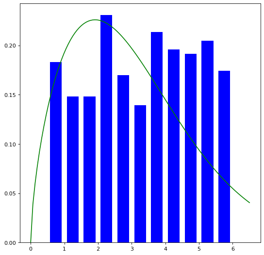
Optimal parameters of Weibull distribution can be displayed using
[10]:
print(f"{params=}")
params=(1, np.float64(1.6611785551133385), 0, np.float64(3.2699297373634497))
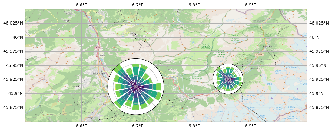
Overlay of a map
This example illustrate how to set an windrose axe on top of any other axes. Specifically, overlaying a map is often useful. It rely on matplotlib toolbox inset_axes utilities.
[11]:
import cartopy.crs as ccrs
import cartopy.io.img_tiles as cimgt
import matplotlib.pyplot as plt
import numpy as np
from mpl_toolkits.axes_grid1.inset_locator import inset_axes

import windrose

ws = np.random.random(500) * 6
wd = np.random.random(500) * 360

minlon, maxlon, minlat, maxlat = (6.5, 7.0, 45.85, 46.05)

proj = ccrs.PlateCarree()
fig = plt.figure(figsize=(12, 6))
# Draw main ax on top of which we will add windroses
main_ax = fig.add_subplot(1, 1, 1, projection=proj)
main_ax.set_extent([minlon, maxlon, minlat, maxlat], crs=proj)
main_ax.gridlines(draw_labels=True)
main_ax.coastlines()

request = cimgt.OSM()
main_ax.add_image(request, 12)

# Coordinates of the station we were measuring windspeed
cham_lon, cham_lat = (6.8599, 45.9259)
passy_lon, passy_lat = (6.7, 45.9159)

# Inset axe it with a fixed size
wrax_cham = inset_axes(
    main_ax,
    width=1,  # size in inches
    height=1,  # size in inches
    loc="center",  # center bbox at given position
    bbox_to_anchor=(cham_lon, cham_lat),  # position of the axe
    bbox_transform=main_ax.transData,  # use data coordinate (not axe coordinate)
    axes_class=windrose.WindroseAxes,  # specify the class of the axe
)

# Inset axe with size relative to main axe
height_deg = 0.1
wrax_passy = inset_axes(
    main_ax,
    width="100%",  # size in % of bbox
    height="100%",  # size in % of bbox
    # loc="center",  # don"t know why, but this doesn"t work.
    # specify the center lon and lat of the plot, and size in degree
    bbox_to_anchor=(
        passy_lon - height_deg / 2,
        passy_lat - height_deg / 2,
        height_deg,
        height_deg,
    ),
    bbox_transform=main_ax.transData,
    axes_class=windrose.WindroseAxes,
)

wrax_cham.bar(wd, ws)
wrax_passy.bar(wd, ws)
for ax in [wrax_cham, wrax_passy]:
    ax.tick_params(labelleft=False, labelbottom=False)
/home/runner/micromamba/envs/TEST/lib/python3.13/site-packages/cartopy/io/__init__.py:242: DownloadWarning: Downloading: https://naturalearth.s3.amazonaws.com/10m_physical/ne_10m_coastline.zip
  warnings.warn(f'Downloading: {url}', DownloadWarning)
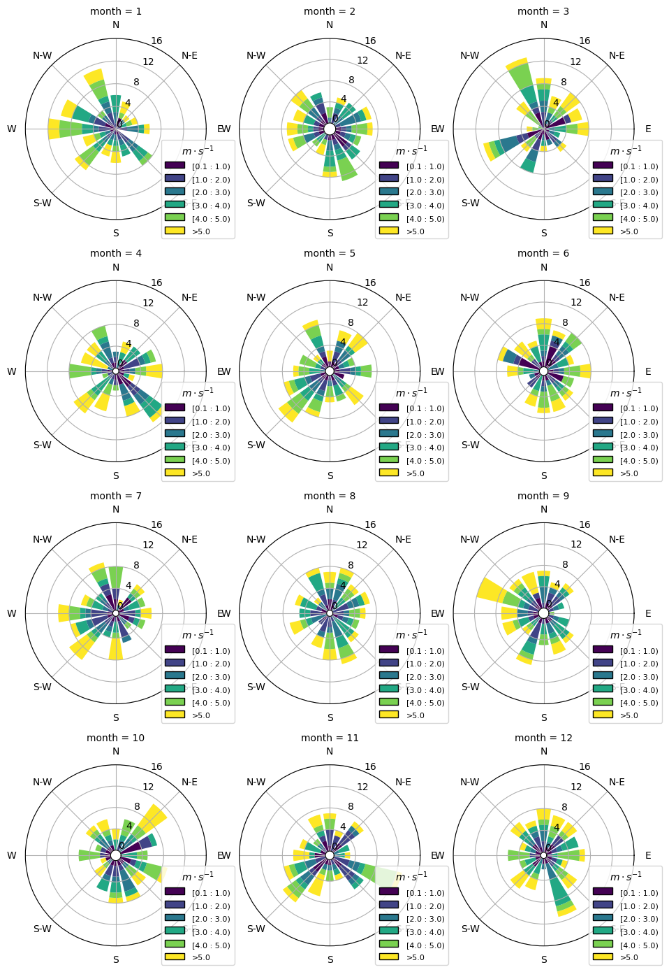
Subplots
seaborn offers an easy way to create subplots per parameter. For example per month or day. You can adapt this to have years as columns and rows as months or vice versa.
[12]:
import numpy as np
import pandas as pd
import seaborn as sns
from matplotlib import pyplot as plt

from windrose import WindroseAxes, plot_windrose

wind_data = pd.DataFrame(
    {
        "ws": np.random.random(1200) * 6,
        "wd": np.random.random(1200) * 360,
        "month": np.repeat(range(1, 13), 100),
    }
)


def plot_windrose_subplots(data, *, direction, var, color=None, **kwargs):
    """wrapper function to create subplots per axis"""
    ax = plt.gca()
    ax = WindroseAxes.from_ax(ax=ax)
    plot_windrose(direction_or_df=data[direction], var=data[var], ax=ax, **kwargs)


# this creates the raw subplot structure with a subplot per value in month.
g = sns.FacetGrid(
    data=wind_data,
    # the column name for each level a subplot should be created
    col="month",
    # place a maximum of 3 plots per row
    col_wrap=3,
    subplot_kws={"projection": "windrose"},
    sharex=False,
    sharey=False,
    despine=False,
    height=3.5,
)

g.map_dataframe(
    plot_windrose_subplots,
    direction="wd",
    var="ws",
    normed=True,
    # manually set bins, so they match for each subplot
    bins=(0.1, 1, 2, 3, 4, 5),
    calm_limit=0.1,
    kind="bar",
)

# make the subplots easier to compare, by having the same y-axis range
y_ticks = range(0, 17, 4)
for ax in g.axes:
    ax.set_legend(
        title=r"$m \cdot s^{-1}$", bbox_to_anchor=(1.15, -0.1), loc="lower right"
    )
    ax.set_rgrids(y_ticks, y_ticks)

# adjust the spacing between the subplots to have sufficient space between plots
plt.subplots_adjust(wspace=-0.2)
Functional API
Instead of using object oriented approach like previously shown, some “shortcut” functions have been defined: wrbox, wrbar, wrcontour, wrcontourf, wrpdf. See unit tests.
Pandas support
windrose not only supports Numpy arrays. It also supports also Pandas DataFrame. plot_windrose function provides most of plotting features previously shown.
[13]:
import pandas as pd

N = 500
ws = np.random.random(N) * 6
wd = np.random.random(N) * 360
df = pd.DataFrame({"speed": ws, "direction": wd})
plot_windrose(df, kind="contour", bins=np.arange(0, 8, 1), cmap=cm.hot, lw=3)
[13]:
<WindroseAxes: >
Mandatory:
df: Pandas DataFrame withDateTimeIndexas index and at least 2 columns ('speed'and'direction').
Optional:
kind: kind of plot (might be either,'contour','contourf','bar','box','pdf')var_name: name of var column name ; default value isVAR_DEFAULT='speed'direction_name: name of direction column name ; default value isDIR_DEFAULT='direction'clean_flag: cleanup data flag (remove data points withNaN,var=0) before plotting ; default value isTrue.
Video export
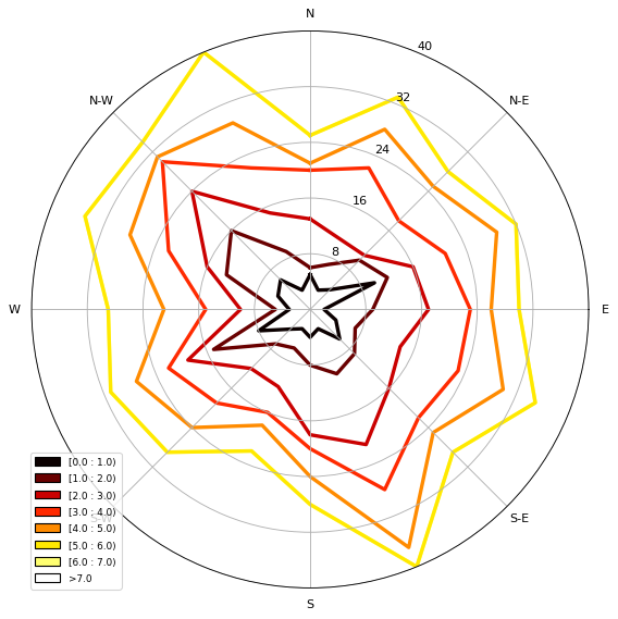
A video of plots can be exported. A playlist of videos is available here, see:
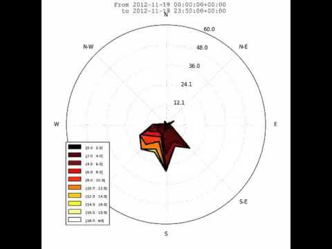
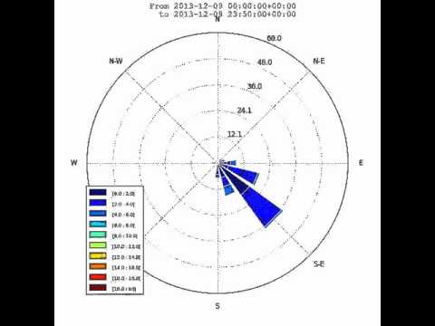
This is just a sample for now. API for video need to be created.
Use:
$ python samples/example_animate.py --help
to display command line interface usage.